Monday, February 28, 2011

ASOTYPE,Animated System Of Typographic Picture Education


Communication via signage is based on function and purpose. The traffic signal is a good example of how a single color communicates without further explanation. When people cross a street they press the button on the traffic signal column. Then, the signal turns red to green in the crosswalk as the signal for the drivers turn green to red. In this case the human shape in the crosswalk signal is quite unnecessary because the effect is not the form but the color. A way to improve the efficiency of the form, the green light should show a human shape actually walking and the red light should show the shape stopping. In addition, since the signal lights on streets already implement a form of animation, blinking, adding simple motion to the existing system is not far from present practice.

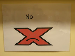
St. Michael House signs


Inaccessible Design?

Just a thought—Accessible design, or design that adheres to accessibility standards and guidelines can often have a kind of clinical feeling, lacking any kind of texture. However, as we’ve learned from our visits to St Michael’s—it is often tactile sensation that has the biggest impact on some of the service users. Could the use of texture, or even the appearance of texture, create a more accessible kind of design in this case?

Paula Scher- some inspiration


'Design for All': Socially Responsible Design or just good sense?

A fragment from a book 'Design for All': Socially Responsible Design or just good sense?

Perhaps by far the most cogent of all these factors is the voice of the users themselves. For many disabled or socially excluded people, technological advances have given them the means to communicate with the world. The Internet and the support it offers for activities such as shopping, banking, voting, entertainment, and education, not to mention the lifelines provided by various online communities, have opened up opportunities that were not possible for these users before. With these communication channels they are also able to make their voices heard, and their need for accessible content, input and output mechanisms, is being proclaimed loud and clear - for those who have ears to hear.


there is the link to more publications
http://www.universaldesign.ie/teachamplearn/resourcesbooksamparticles

10 things to know about Universal Design

http://www.universaldesign.ie/exploreampdiscover/10thingstoknowaboutud

48-hour Inclusive Design Challenge in Seoul

Inclusive design

When T-shaped met T-shaped from Enabled by Design on Vimeo.


Julia Cassim is Senior Research Fellow at the Royal College of Art Helen Hamlyn Centre, which she joined in 2000. Her main research focus since then has been the development of creative partnerships between people with disabilities and designers; ways to involve them in the design process to encourage innovative, inclusive thinking and spreading the word about inclusive design to design and business communities.

Detail Design/DCC Signage

Detail's signage created for for Dublin City Council Leisure Centres—“A complete set of a illustrative pictograms were designed. The system follows accessibility guidelines.”


Brainstorm 22/02/11

Arts and Disablitity Ireland

www.adiarts.ie—About page for Arts and Disablitity Ireland, a great organisation that promotes the inclusion of people with disablities in the Arts on all levels, as spectators, creators or participants. Ties in nicely with the Advocacy side of the organisation.

European Standards on Accessible Information

New document on the European standards for accessible information from Inclusion Ireland.

Inclusive Design Principles

Found this publication—It's focus is mainly architecture/interiors but it gives a handy and simple introduction to Inclusive design.

Lance Wyman

Lance Wyman is also a master of iconography that is easy to read and very accessible. Below is some of his work for the National Zoo and the 1968 Olympic Games in Mexico. His work is also softer than Aicher's, with a greater sense of play.


More from the 1972 Olympic Games/Otl Aicher


Brochures from the 1972 Olympic Games

These brochures were designed by Otl Aicher for the 1972 Munich Olympic Games (More here). For the games, Aicher devised a whole system of icons for events which were simple, graphic forms and not text-based. As literacy and inclusive-design is an issue in the St. Michael's House project, we could certainly look to Aicher's work for inspiration.