 Animated pictograms from edenspiekermann. (Click to see animation.)
Tuesday, March 15, 2011
Sunday, March 13, 2011
Changing around th background colours.
Saturday, March 12, 2011
Library literacy services
Dewey Pictograms
Reproducible images portraying collections within the Dewey Decimal Classification System, enabling people with disabilities, low literacy skills, etc., to better locate materials in the library's collection; these can be mounted on bookstacks or special mounts in the collection.
Many thanks to OCLC (all copyright rights in the Dewey Decimal Classification System are owned by OCLC; Dewey, Dewey Decimal Classification, DDC, OCLC and WebDewey are registered trademarks of OCLC) and to Oakland (CA) Public Library for making these images freely available. The resource is a result of a collaboration between the Oakland Public Library and the East Bay Learning Disabilities Association (EastBayl da.org), supported by the California State Library.
The 88 images were created by Shelby Designs & Illustrates (Oakland, CA) and the work was supported in part by the U.S. Institute of Museum and Library Services under the provisions of the Library Services and Technology Act.....
The Newsletter of Western Center for Microcomputers in Special Education
Create
In July 2001 the management of a number of Sheltered Workshops for people with disabilities in the Rehab Group transferred from National Learning Network (formerly NTDI) to RehabCare, which is the health and social care division of Rehab. These sheltered workshops were originally set up in the 70’s as a facility for people with long term disabilities considered unable for open employment. At the initial stage of this ‘changeover’ there was a lot of concern from people in these workshops as to what this change in management would bring. The primary change has been the closure of many of the sheltered workshops being replaced by programmes with a rehabilitative, developmental and therapeutic focus. For some this created a sense of ‘work’ displacement and for others an opportunity for self-development.
Tuesday, March 8, 2011
Harry Pearce (Pentagram)- Launchpad Signage
Just something that caught my eye from the excellent Harry Pearce of Pentagram. The link below is worth a look too.
http://pentagram.com/en/new/2008/09/new-work-launchpad.php
Michael Bierut (Pentagram)-Library Initiative
Heres a good link to the Library Initiative art directed by Michael Bierut of Pentagram for the Robin Hood Foundation.
http://www.pentagram.com/en/new/2009/03/murals-for-the-library-initiat.php
Athens 2004
The Athens 2004 Sport pictograms were inspired by three elements of ancient Greek civilization. The simplicity of the human form is inspired by the Cycladic figurines. The artistic expression of the pictogram derives from the black-figure vases, where solid black shapes represent the human body and a single line defines the detailing of the form. One of the few pictogram solutions which finds a balance between artistic expression and clear communication
Moscow 1980
Interestingly the Moscow 1980 pictograms were ,by request of the Olympic Games Committee, were undertaken by students of several art colleges as part of their dissertations. The winning designs, by Nikolai Belkow, are smoother in outline appearance then the Otl Aicher 1972 pictograms (and reused in 1976) as they are constructed at angles of 30 ad 60 degrees.
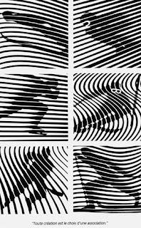
Roger Excoffon Grenoble '68 Pictogram
OpArt inspired pictograms of the 1968 winter olympics using scan lines to create movement. The movement created is indicative of the respective discipline eg. the slalom twists
Monday, March 7, 2011
From Brian Nolan
Signage guidelines
http://www.nda.ie/cntmgmtnew.nsf/0/1E4453E67C647DCB80257088005E9F3A/$File/access_handbook_07.htm
Design Reference
http://l2m3.com/index.php?lang=en&key=projekttypLeitsysteme&id=98
http://www.iconwerk.de/
http://www.thenounproject.com/
Thursday, March 3, 2011
A SIGN SYSTEMS MANUAL Theo Crosby, Alan Fletcher and Colin Forbes


Crosby/Fletcher/Forbes -the British company that would later form the nucleus of design group pentagram, decided to produce
a book A SIGN SYSTEMS MANUAL"This book illustrates and describes a simple basic system for designing, constructing and displaying signs, together with examples of schemes which havbe been produced by leading international designers. The first part of the manual is a brief survey of the history of alphabets, the development of letters and type. This background is essential in order to understand the reasons, evolutionary and functional, behind the peculiarites and characteristics of lettering and typefaces."
Contents:
Terminology
Letter Styles
Letterforms
Letter Proportions
Display and Sign Letters
Airport Letters
Airport Alphabet
Unit Measurement System
Letter, Word and Line Spacing
Margin Spacing
Panel Sizes
Letter Sizes
Message Sizes
The Arrow
Typographic Layout
Panel Layout
Panel Contributions
Symbols
Sign Classification
Colour Coding (this is the only color in the book)
Sign Location and Fixings
Unit Spacing Chart
Specifications, Reproduction and Material
Sign Schedules
Type Style Rules
Sign Programmes
Posters from the 1972 Olympics


Sassoon

Not shown in its best light there but I have seen it used to good effect. Check out this signage for the children's area in the basement of the Science Museum, Designed by Norman Hathaway—who said the following about Rosemary Sassoon:
“Rosemary Sassoon is the only person I know of who has done extensive readabilty testing with children. Her resulting typeface features details that help dyslexic kids differentiate between characters. Aside from all that, I think it’s an attractive face. I like that Sassoon doesn’t consider herself a designer, but a researcher. Perhaps that mindset made for the innovative end result.”
Read more here.


Wednesday, March 2, 2011
Tactile Learning
http://www.brighthub.com/education/special/articles/93950.aspx
Heller on Olympic Pictograms
Link to AIGA standard signs
http://www.aiga.org/content.cfm/symbol-signs
Some more photos from St. Michaeals House
Some different photos from St. Michaels House... next visit the photographic research could be more expansive then this. More documentation of the building as a whole is needed I think.


